Module wrapper
Technical specification of the frame every result module sits in.
Docs: Module wrapper. | Design: Figma
Kind
Front-end
Scope
One presentational card. It draws a header - a title and up to two action buttons - a divider, and a body it knows nothing about. It holds no state, fetches nothing and decides nothing about the result. Every result module is this card around its own content: single axis, double axis, multi axis, horizontal bar, Nolan chart, archetype and traits.
What it does not cover, and where that lives:
- What the two buttons open - the statistics and the explanation are their own functionalities, see module statistics and info modals. The wrapper only reports that a button was pressed.
- What goes in the body - each module's own doc and spec, built from the universal axis.
- Whether a module is shown at all - the result screen decides. A module that is not configured is never handed to the wrapper, see short results card.
- What happens when a module fails to draw - containment belongs to the result screen, which is the one that can decide what replaces a broken module.
- Checkpoint cards - they borrow a module's visual, not this frame.
Data
| Input | Data | Meaning | Rules |
|---|---|---|---|
| Title | Text, or a component | What the card is called | Optional. Text is the usual case; a component replaces it entirely |
| Statistics action | Present or absent | Whether the card offers the module's statistics | Optional, independent of the info action |
| Info action | Present or absent | Whether the card offers the module's explanation | Optional, independent of the statistics action |
| Body | Any content | What the module draws | Optional as far as the wrapper is concerned |
A text title is the module name, written by the quiz author. It is author-supplied, so it has no length limit and can be empty.
A component title is anything a module puts in the title's place. The Nolan chart puts its coloured quadrant name there, the archetype puts its result. It may be interactive; what it does is specified by the module that supplies it.
An action is one of the two header buttons. The wrapper does not know what is behind either of them.
Interface
| Direction | Name | Shape | Notes |
|---|---|---|---|
| In | Title | Text or a component | Drawn in the title slot |
| In | Body | Any content | Drawn under the divider |
| In | Accessible name | Text | Needed only with a component title, which the wrapper cannot read a name from |
| Out | Statistics requested | An event with no payload | Raised when the statistics button is pressed |
| Out | Info requested | An event with no payload | Raised when the info button is pressed |
An action exists exactly when something is listening for it. There is no separate switch to show a button, so a button that does nothing cannot be drawn.
Behaviour
Title
| Case | Behaviour |
|---|---|
| Text title | Drawn in the title pill, centred, on one line |
| Text title longer than the slot | Truncated visually, complete for assistive technology |
| Component title | Replaces the pill. The wrapper adds no border, background or text styling of its own |
| Component title larger than the slot | Clipped to the slot. It never grows the header or pushes an action out |
| Text title pressed | Nothing happens. A text title is not interactive |
Actions
| Case | Behaviour |
|---|---|
| Both present | Statistics first, info last, at the end of the header |
| Statistics only | One button, at the end of the header |
| Info only | One button, at the end of the header |
| Neither | No buttons |
| Button pressed | The matching event is raised once per press. Nothing else on the card changes |
Each button keeps its own icon and its own position relative to the other. A missing button leaves no gap: the title slot takes the room.
Layout
| Case | Behaviour |
|---|---|
| Header | Title slot first, actions after it, on one row of fixed height |
| Title slot width | Whatever the actions leave. It is widest with no actions and narrowest with two |
| Divider | Drawn across the full card width between header and body |
| Card width | The width the card is given |
| Card height | The header plus whatever the body needs. There is no minimum and no maximum |
States and lifecycle
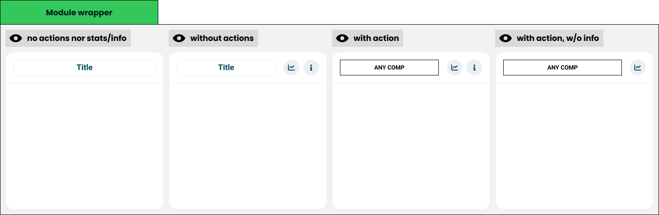
The card has no state of its own. What it renders is fully decided by which inputs are present. Figma draws four configurations:
| State | Condition | What is possible in it |
|---|---|---|
| Titled card - "no actions nor stats/info" | Text title, no actions | Read the body |
| Text title with both actions - "without actions" | Text title, statistics and info | Read the body, open statistics, open the explanation |
| Component title with both actions - "with action" | Component title, statistics and info | The same, plus whatever the title component offers |
| Component title with statistics - "with action, w/o info" | Component title, statistics only | Read the body, open statistics, plus whatever the title component offers |
The title kind and each action are independent, so four more configurations exist that Figma does not draw: a text title with one action, a component title with info only, and a component title with no actions. They follow the same layout rule and need no design of their own.
Rules and constraints
- The two buttons are the only way out of a module. The wrapper adds no other control - no menu, no close, no collapse, no link on the card itself.
- An action is present or absent, never disabled. There is no disabled, loading or badge state for either button. A module whose statistics are not available yet shows no statistics button.
- The wrapper never looks inside the body. It does not measure it, scroll it, clip it to a height or react to what it contains.
- The wrapper never hides itself. With an empty body it still draws its header. Leaving a module out is the result screen's decision.
- One size. There is no compact variant. The card keeps its padding and header height at every width, as the universal axis does, so a module looks the same wherever it is drawn.
- The frame does not change per module. A module cannot restyle the card, move the actions or remove the divider. The title slot is the only part it controls, which is the price of every module looking like the others.
Invalid and edge input
| Input | Behaviour |
|---|---|
| Title missing, empty or only whitespace | Treated as no title |
| No title and no actions | The header and the divider are not drawn. The card is its body alone |
| No title, with actions | The header is drawn with the actions in their usual place and an empty title slot |
| Title text with line breaks | Collapsed to one line |
| Body missing or empty | Header and divider are drawn, nothing under them |
| No title, no actions and no body | An empty card |
| Body wider than the card | The body is given the card's inner width. Content that does not fit is the module's to solve; the wrapper never scrolls sideways |
Nothing here throws. Titles are author-supplied and can be wrong; a card with a bad title must still show its result.
Non-functional
Rendering contexts
The card renders on the result screen and in comparison mode. Where a result is drawn without interaction, such as the generated image of the short results card, the caller leaves both actions out and gets the titled card. The wrapper has no static mode and does not know which context it is in, so nothing on it may depend on hover or on viewport size.
Accessibility
- The card is a labelled region, named by its text title, or by the accessible name passed in with a component title.
- A text title is a heading, so a taker using a screen reader can move from module to module.
- Both buttons are icon-only, so each has a text name that includes the module's title. A screen holding a dozen modules must not announce a dozen identical "statistics" buttons.
- Focus order follows reading order: title component if it is interactive, statistics, info, then the body.
- Both buttons work from the keyboard and show a visible focus state.
- The pressable area of each button is at least the minimum touch target, even though the button is drawn smaller. These two buttons carry the caveats that make a result honest, so they must not be hard to hit.
Performance
A result screen holds one wrapper per module. The wrapper does no measuring and no work beyond layout, so its cost does not grow with what the body contains.
Dependencies
Relies on:
- Module wrapper doc - the idea this implements.
- Universal axis - what module bodies are made of, and the one-size rule this spec repeats.
- Module statistics and info modals - what the two events lead to. Neither is written yet, which is why the wrapper stops at raising an event.
Relied on by:
- Every result module: single axis, double axis, multi axis, horizontal bar, Nolan chart, archetype and traits.
- The short results card, which renders the same modules without actions.