Answers comparison
Question by question: what you said, what they said, and where you split.
Decision: ⚪ idea
Design: Figma
Context
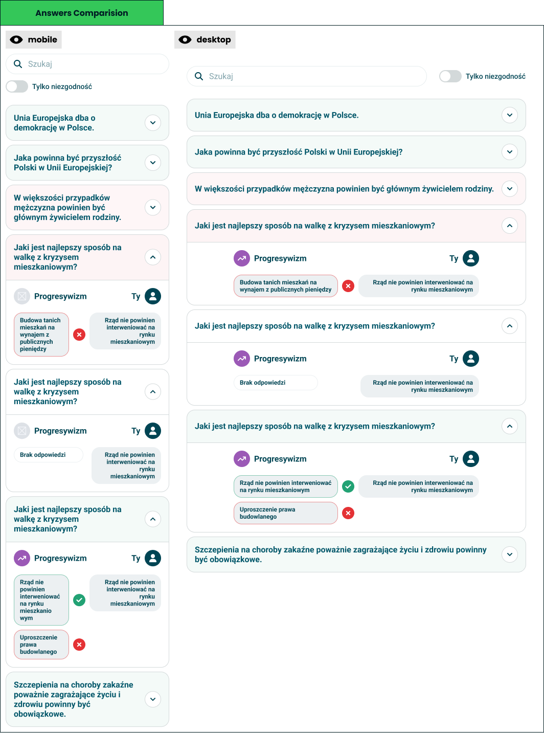
The other half of comparison mode, and the half that works in both modes - against a friend, and against an orientation. Every question the taker answered becomes a row that opens into the two answers beside each other.
How it behaves:
- A list of questions, collapsed - the statement is the row, and expanding it reveals the answers underneath.
- Two answers, one verdict - your answer and theirs sit side by side with a mark between them: a tick when they agree, a cross when they do not.
- The orientation is named - each expanded row says which orientation the question fed, so a disagreement is legible as a disagreement about something.
- Rows are tinted by outcome - agreement and disagreement are visible before anything is opened.
- Only disagreements - a toggle drops every row where the two of you matched, which is what most people are actually looking for.
- Search - a hundred questions is unbrowsable without it.
- No answer is a state - a question one side skipped shows as unanswered rather than as a disagreement.
- Multi-answer questions show every pick - each selected answer gets its own mark, so partial agreement stays visible.
Against an orientation the right-hand side is what that orientation implies rather than what a person said, which turns the same view into "where do I actually differ from progressivism".
Opportunity
- It is the evidence behind the result - every number on the result screen ultimately comes from these rows, and this is the only place a taker can audit it.
- Disagreement is the interesting part - the filter turns a long list into the three questions worth arguing about.
- It works without a second person - orientation mode gives a solo taker the same feature, which is most takers.
- It teaches what an axis means - seeing the questions behind progressivism explains the label better than a description could.
- Cheap to build on what exists - answers are already stored per question; this is a view over them.
Risk
- Answers are more sensitive than results - a score is an abstraction, an answer is a statement someone made, and this shows it verbatim to another person.
- It is the sharpest social surface we have - a filtered list of everything you disagree about is an argument generator, and we built the filter.
- Long quizzes make long lists - a hundred rows is a scrolling exercise, even with search.
- A tick reduces a nuanced answer - agreeing for opposite reasons still shows as agreement.
- Comparing to an orientation implies it has a position - what "progressivism would answer" is our modelling, presented as if it were a participant.